WOOF: Redefining the Ollie Design System to be Unified and Simple
A collection of reusable components, patterns, and guidelines,
along with the principles and best practices for using them.
From

to


Role
Team
Brand
Ollie Design System inventory
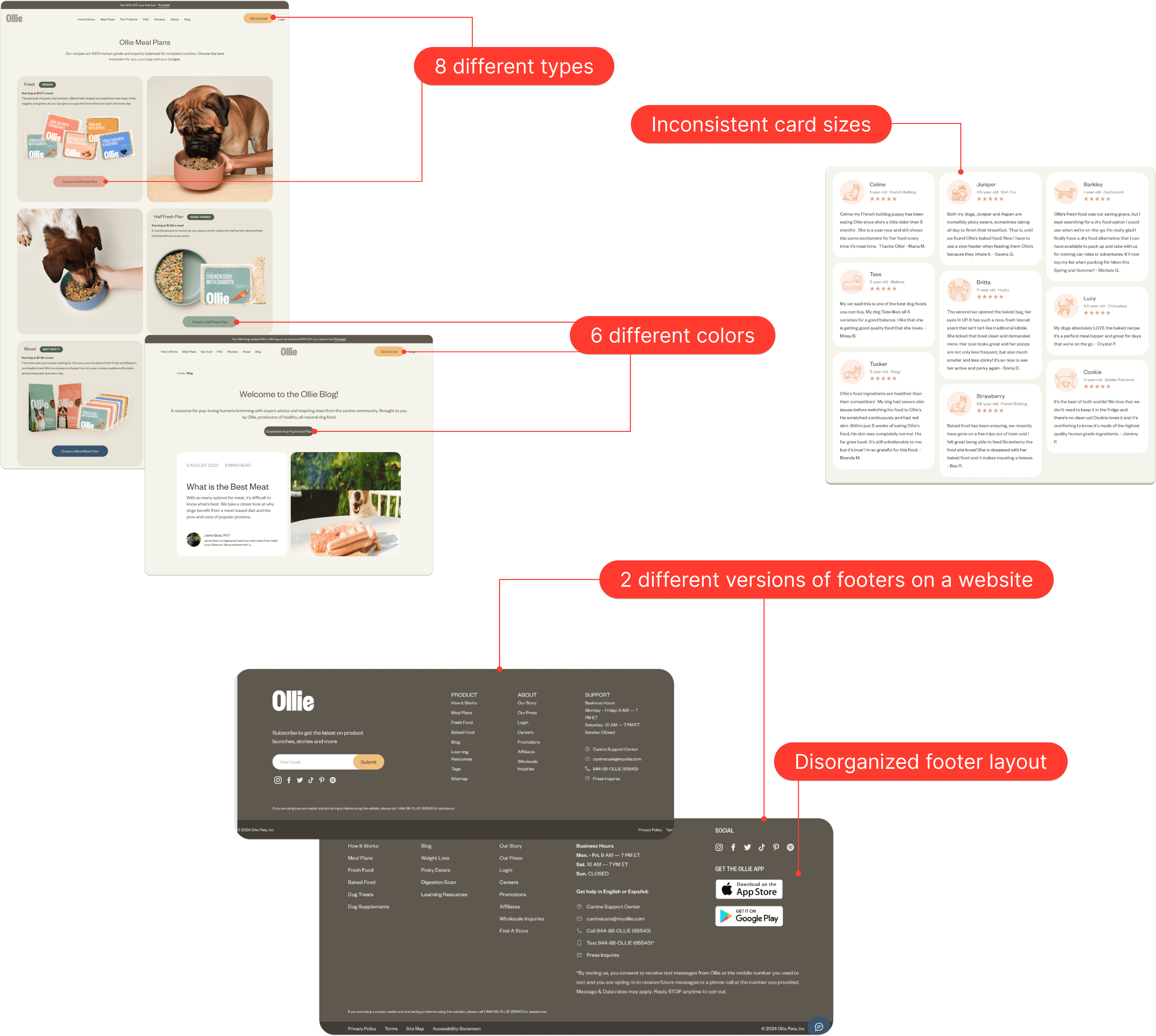
Following Brad Frost's fundamental steps for interface inventory creation, we meticulously traversed the original interface, capturing screenshots of UI components.

After interface inventory on Ollie's website we've uncovered four key challenges:
Inconsistency in Design
This can confuse users and make the site feel disjointed.
Heavy Workload
A heavy workload can slow down progress.
Lack of Efficiency
It could involve inefficient workflows, outdated technology, or redundant tasks.
Difficulty in Collaboration
It's difficult to coordinate efforts among team members or departments.
Problem #2
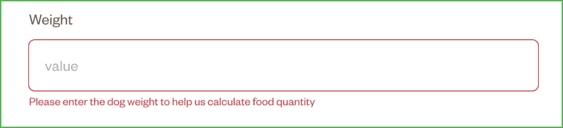
Accessibility issues

Cohesive
Simple
Empathetic

Accessible
The contrast ratio should be at least 4.5:1 for regular-sized text and 3:1 for icons and large text (24px and above or 18px bolded text), ensuring enhanced readability.
Avoid using pure black text on a pure white background, as it may pose readability challenges for users with dyslexia.
Convey information using multiple cues (e.g., labels, icons) to supplement color coding, ensuring clarity for all users.
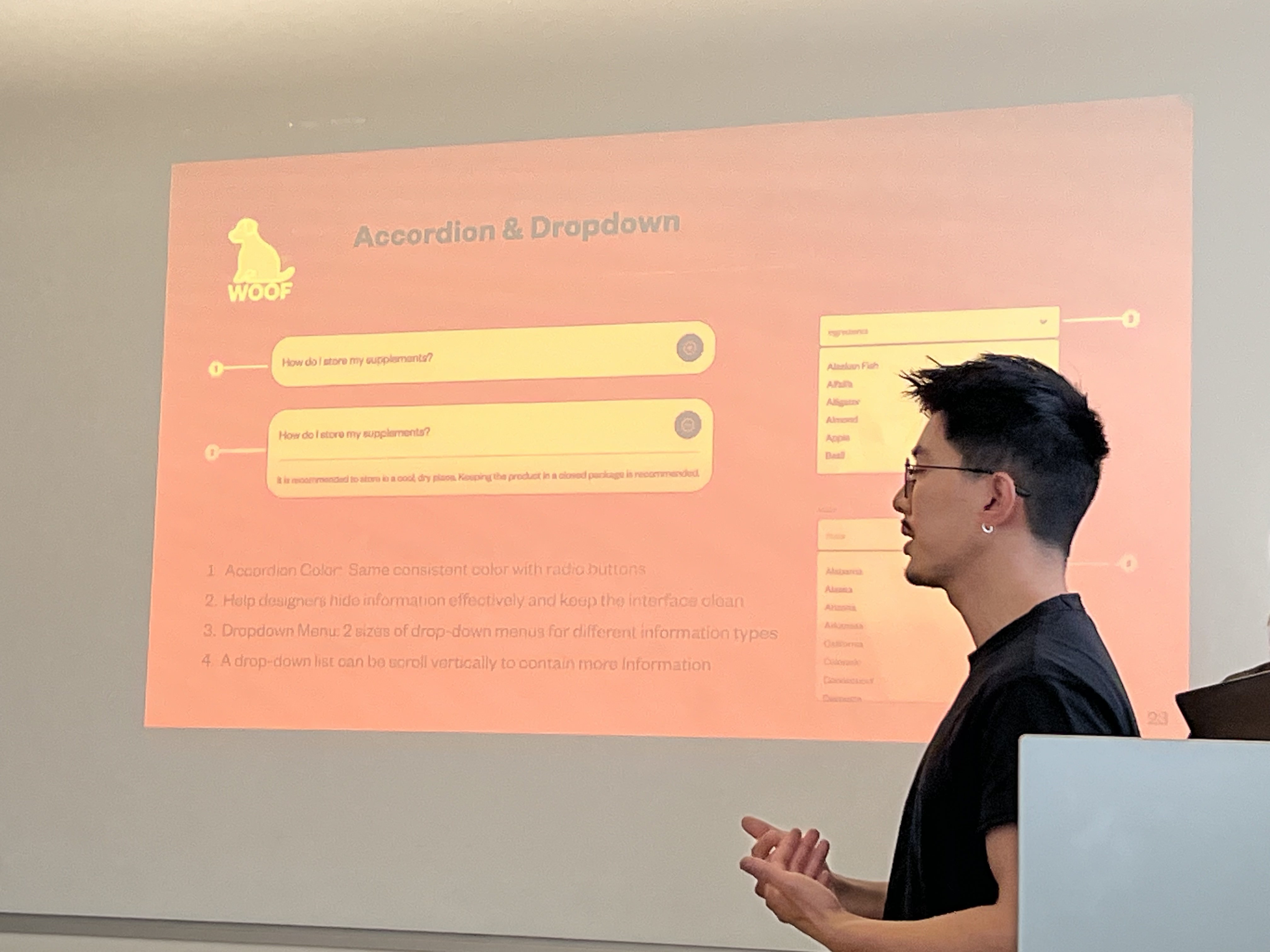
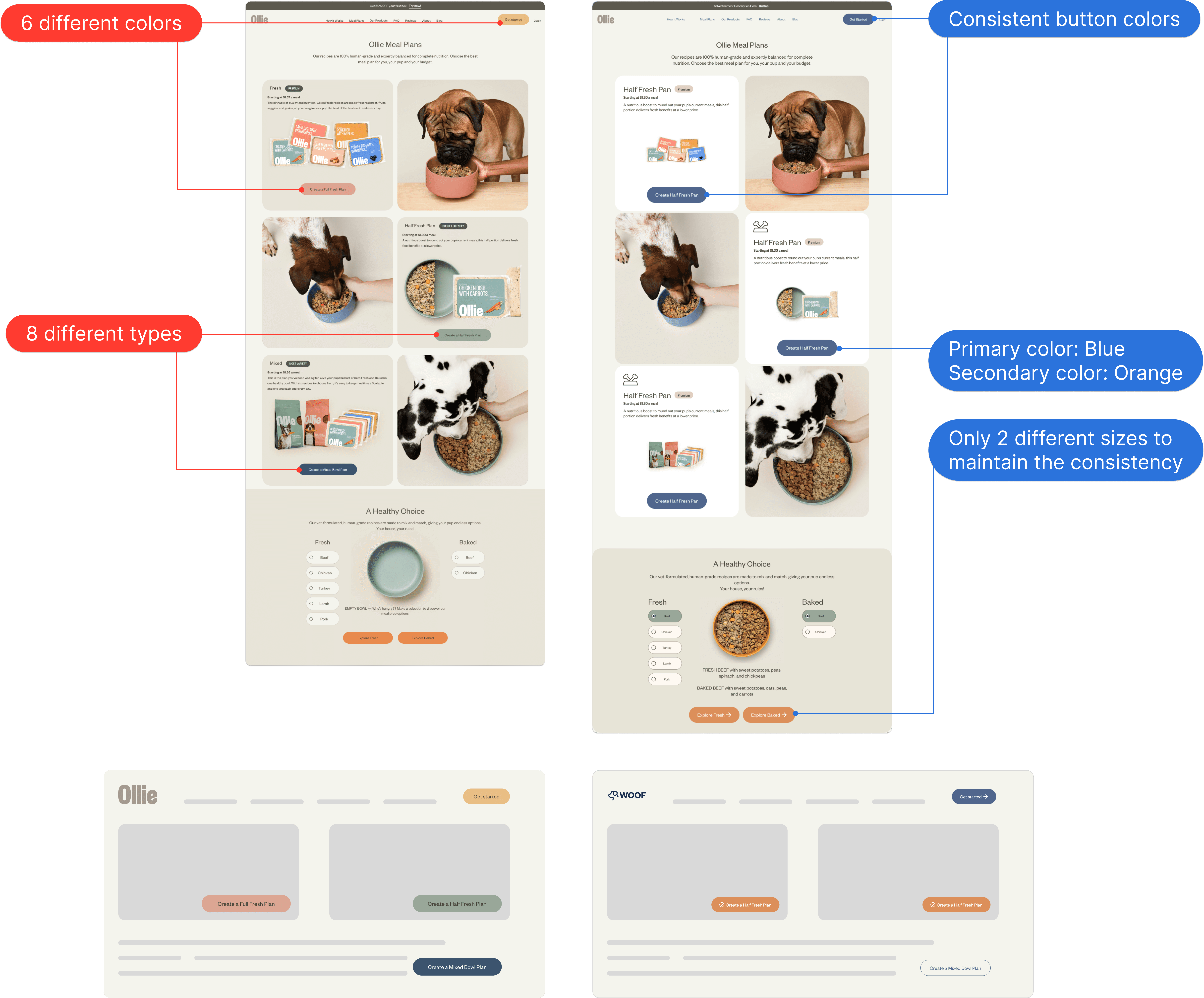
Solution #1
Designed for consistently components
Team WOOF has overhauled the Ollie Design System by adhering to WOOF design principles, ensuring the creation of consistent components. Our primary approach for crafting these components was the implementation of the Atomic Design Methodology.

Solution #2
Designed for accessibly
We've embraced the WCAG 2.2 guidelines to guarantee the accessibility of every element. By catering to users with diverse needs, we've crafted a digitally accessible environment. We firmly believe that exemplary User Experience Design should cater to everyone, regardless of their unique requirements.

Cohesive
Simple
Empathetic

System thinking
"From atoms to pages, from Ollie to WOOF" — this project provided me with the opportunity to dive deep into the entire spectrum of design, from individual components to full pages. Through inventorying, reassembly, and design, we've crafted and launched a superior solution.
The WOOF design system marks the initial step in this journey. As we move forward with updates and operations, our commitment remains unwavering: to consistently seek out the best solutions to the challenges we encounter.
Do: Conveying information by using multiple cues
Don't: Conveying information by only using colors

Do: Leveraging button text directly related to the product

Don't: Over explain with button text

Do: Making sure the contrast ratio over 4.5:1

Don't: Using low contrast color